Tuesday 18 September 2012

route 2.....


more route 2.....


Route 2 experimenting

Experimenting with image, type and positioning.These could be images in a book, posters or for a t-shirt.

Route 2 Experiments


I am experimenting with type and image and I am using inspirational quotes from the book I mentioned in my last post. This type of design is more personal to me that is why I am going to pursue a self promo project that says something that comes from my heart.

Friday 7 September 2012

Route 2 experimenting

This is one of my photographs I took whilst I was up Devils Dyke. I also picked out a phrase from a book I have called 'THOUGHT FOR TODAY' NO AUTHOR I think it has been complied by many people. It was published by Brahma Kumaris or bkpublications.

It is a brilliant book that I use everyday to help give me a positive frame of mind each and everyday and it works.

I intend to manipulate the photography I do have to test the results I get, to see what comes out best and what will qualify as a good design.

Monday 3 September 2012

Self Promotion (route 2) Photography and Typography combined

 I have decided to look into making my own scenic photographs, manipulating them and adding typography. Typography that is meaningful and maybe sayings that inspire people to go with a good image. This might take the form of a book, maybe a t-shirt print or a set of posters..... This might be digitally, this might be screen printed however a lot of experimentation will be taking place shortly to see what would work. Here are a few beautiful shots I found on the internet and these are the sort of photographs I would like to make myself and to use in my work. My photography to follow shortly.....


I like close up shots of nature too not entirely sure which angle i am going to go with this, i.e. closes ups of nature or scenic views....

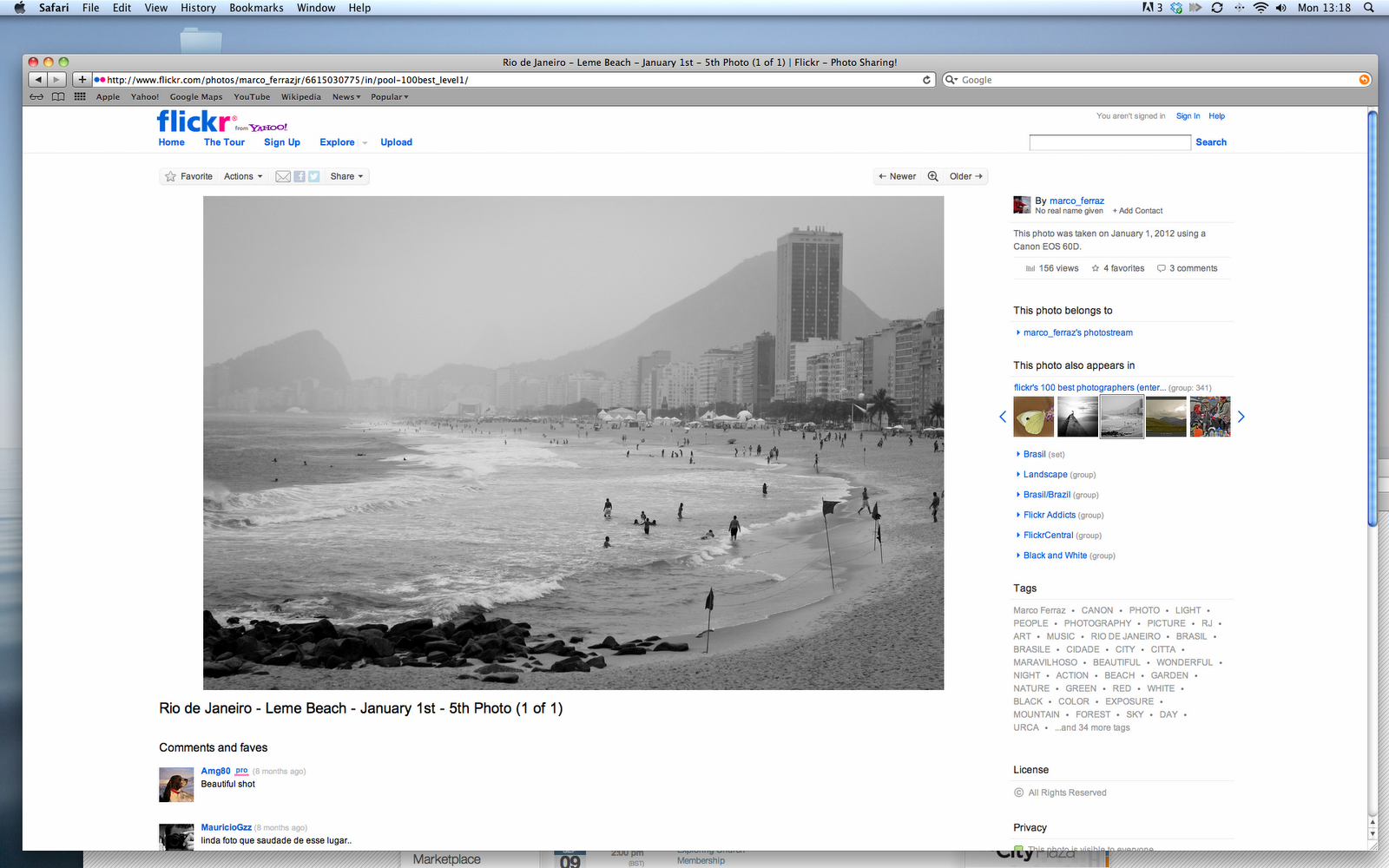
 Black and white photography is also something I would like to consider. This photograph although taken on a sandy beach, modified to black and white it gives the photograph some darkness, almost like the scene is cold, cloudly and the rain is about to set in?? Like British weather??


Thursday 9 August 2012

Balloon packaging


I am looking at possible packaging for my balloon self-help product. Such a product might be used in the NHS in cognitive behavioural therapy (CBT) sessions as a task to carry out to help people cope with their depression. Not sure entirely how the product will work yet but its just one idea. Watch this space...


Here is some GREAT packaging inspiration...

Dino! chewing gum packaging. The chewing gum shape has been taken advantage of and made to look like dinosaur teeth in the packaging. Clever idea! How could I incorporate balloons into the actual shape of something? hmmm

I Love block colours. The brand name cut out and stands out because of the bright orange on the inner box.

Very cool idea if using women and semi-naked women to help a product stand out. 
We thought of the product as any fast moving consumer good; with our mind towards the creation of a pack that would in fact sell putty, we created a design that could differentiate the brand (Petrocoll) from its competition. 

We employed the female element as our communication platform; a female figure would seem quite out of place within a construction site and would -we hoped- create a buzz among people in the business. 

Every female figure was dressed up with clothing of various degrees of transparency - the idea being not to be provocative, but to relate the product characteristics (degree of putty overlap), with the respective garment.

Again block colours I love. The use of a 'hatch' in from of words and numbers also are affective  and something I might take advantage of...

Simple, clever idea. Image of a bulldog. Tongue area of image cut out so that the content colour can be seen. It stands out and makes you look twice to have a look and see what the brand or product is.